Carleton · Comparative research
Information hierarchy / Interaction design
HUD information hierarchy for competitive FPS games
The problemIn globally popular competitive FPS games, players read health, objectives and abilities in split seconds. Competing decoration and shifting positions raise cognitive load and slow scanning. (Blizzard reports Overwatch has passed 100 million cumulative players—context for the audience, not reach of this concept.)
My contributionA conceptual comparison of VALORANT, Counter-Strike and Overwatch HUDs, exploring glanceable signal priority.
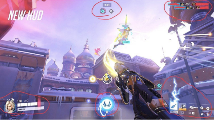
Game HUDs compared
3
Comparative HUD review informing layout concepts.
Critical signals
Health and objectives
Spatial hierarchy
Stable priority positions
Layout concepts
Glanceable status and alerts
- My role
- UX researcher & design concepts
- Team
- Academic research context
- Timeline
- Independent research project
- Tools
- Heuristic evaluation, User feedback, Recommendation mockups
Comparative game HUD research and redesign concepts.
Process
The work behind the decisions.
- 01
Compare interface signals
Reviewed VALORANT, Counter-Strike (CS:GO / CS2) and Overwatch HUDs for glanceability, signal priority (health, objective, abilities), hierarchy stability and scan efficiency.
- 02
Identify attention conflicts
Used heuristics and user feedback to identify competing decorations and inconsistent signal placement.
- 03
Explore hierarchy concepts
Developed recommendation mockups and layout concepts with clearer priority and consistent spatial positions.
Key decisions
Design decisions that shaped the experience.
Give critical signals stable positions
Prioritize high-importance status in consistent spatial locations to support quick scanning.
Trade-off
Consistency must retain enough distinction between health, objectives and abilities.
Reduce competition, retain alerts
Reduce decorative competition while keeping critical alerts and status visible.
Trade-off
Simplification should not remove information players need in fast-paced situations.
Design value & supporting evidence
HUD information hierarchy for competitive FPS games
A comparative review of three game HUDs produced hierarchy concepts for glanceable status; no effect on engagement or player performance was measured.
- Visual scanning comparison
- 3
- Game interfaces evaluated, not three deployed redesigns.
- Glanceable HUD layout concepts
- Information hierarchy
- Conceptual recommendation mockups.
Reflection
Fast-paced interfaces need a clear order of attention. Future testing would compare signal recognition and glanceability in interactive concepts.
Next case study
Cross-platform interaction consistency
I refined navigation and familiar messaging actions across web, Android and iOS, using usability findings to guide iterations.
View case studyCore messaging
Familiar actions
Cross-device patterns
Web / Android / iOS
Usability refinement
Feedback and localization